
Why Most Pitch Decks Fail and What Investors Actually Read
The average investor spends under four minutes on a deck before deciding whether to keep going. Some studies put it closer to three minutes and forty-four seconds. Roughly a third bounce inside the first ten seconds. That number should change how you build the thing, and for most decks I’ve seen, it hasn’t.
Investors scan, they don’t read
Nobody sits down with your deck the way you sat down to write it. They open it between two other meetings, flick through, and decide in seconds whether it’s worth slowing down for. That means the deck has to work as a scan, not as a document. If a slide needs the founder standing next to it explaining what it means, the slide has already failed, because most of the time nobody is standing next to it.
The mistakes that actually kill decks
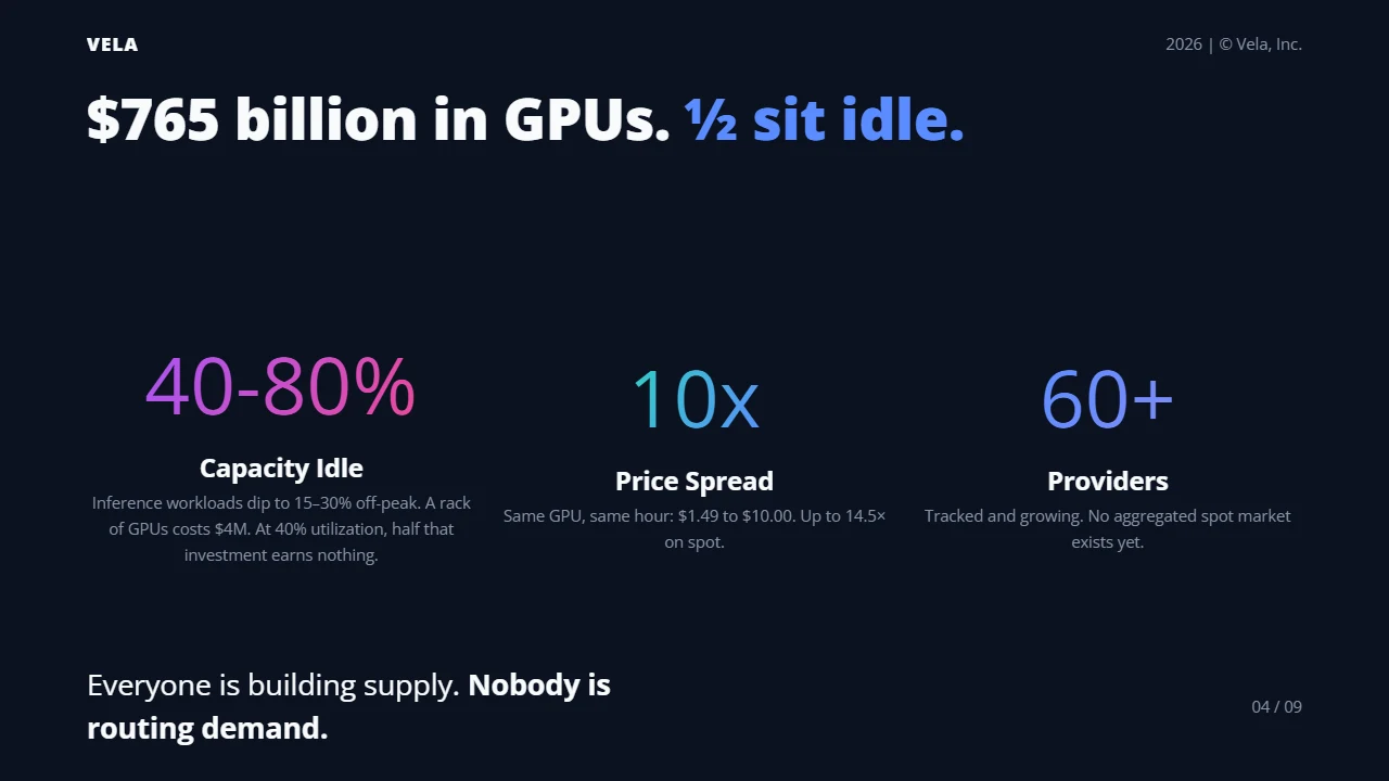
The opening doesn’t earn attention. A logo slide and a mission statement is not a hook. A number, a stat, or a product screenshot that makes the reader want the next slide is a hook. You have ten seconds before a third of readers are already gone, so the first slide can’t be throat-clearing.
Too much text. If a slide requires the founder to talk to make sense, it fails the version of the deck that gets forwarded without you in the room, which is most versions. One idea per slide, said in as few words as truthfully possible.
No business model, or a vague one. If an investor cannot explain how you make money to their own partner in one sentence after reading your deck, the deck didn’t do its job. This is not about oversimplifying a real business, it’s about making sure the one true sentence is actually on the page.
Hockey-stick projections with nothing under them. Investors in 2026 have seen enough speculative revenue charts that a hockey stick with no real customer behavior behind it reads as a red flag rather than ambition. Ground every forecast in something that already happened.
No visual hierarchy. Every slide should tell the eye where to land first. A big number, a short headline, one supporting line. If everything on the slide is the same weight, nothing on the slide gets read.
No clear ask. A “thank you” slide with no next step is the most avoidable mistake on this list and one of the most common. Decks that close with a specific ask, a round size, a meeting request, get meaningfully more follow-up than decks that just stop. Say what you want the reader to do next.
What format actually buys you
None of the above is about design polish. A deck can look plain and still work, because what’s failing in most rejected decks is the thinking, not the font. But format isn’t nothing either: a slide that’s easy to scan gets read in the four minutes you have, and a slide that isn’t gets skipped past regardless of how good the underlying number is. Readability is the floor, not the differentiator. Clear it and then the content has to do the rest.
What I do differently now
I write decks as plain text with Slaide - one file, one idea per slide, theme picked once so nothing on slide 9 looks like it drifted from slide 2. Not because the format wins funding, it doesn’t, but because writing in a text file makes it obvious when a slide has too many words on it. There’s no space to hide a paragraph behind a text box you can shrink to fit. If the sentence is too long for the slide, you feel it while you’re typing it, not after a partner points it out.
The content is still the whole game. Know your number, know your model in one sentence, know your ask. The deck’s only job is to not get in the way of the reader finding those three things in under four minutes.